SCBWI Success Story: A Picture Book Collaboration

by Deborah Abela and Marjorie Crosby-Fairall

WHERE IT ALL BEGAN: A bear and a boy

THE BEAR

IMG_4139_2 smaller.jpg

In 2015, a group of authors and illustrators went to Taronga Park Zoo, Sydney, for a day of drawing and writing. We chose five locations and it was Deb’s job to give creative prompts at each. One of the destinations was the bear sanctuary.

The creative prompts were:

Bear Declared Hero

Hunt for Missing Bear

First Bear in Space.

It was here we saw Mr Hobbs, a sun bear who’d been rescued from a cage in Cambodia after his mother had been killed by poachers. He’d been deeply affected by the separation and found it hard to relate to the other bears.

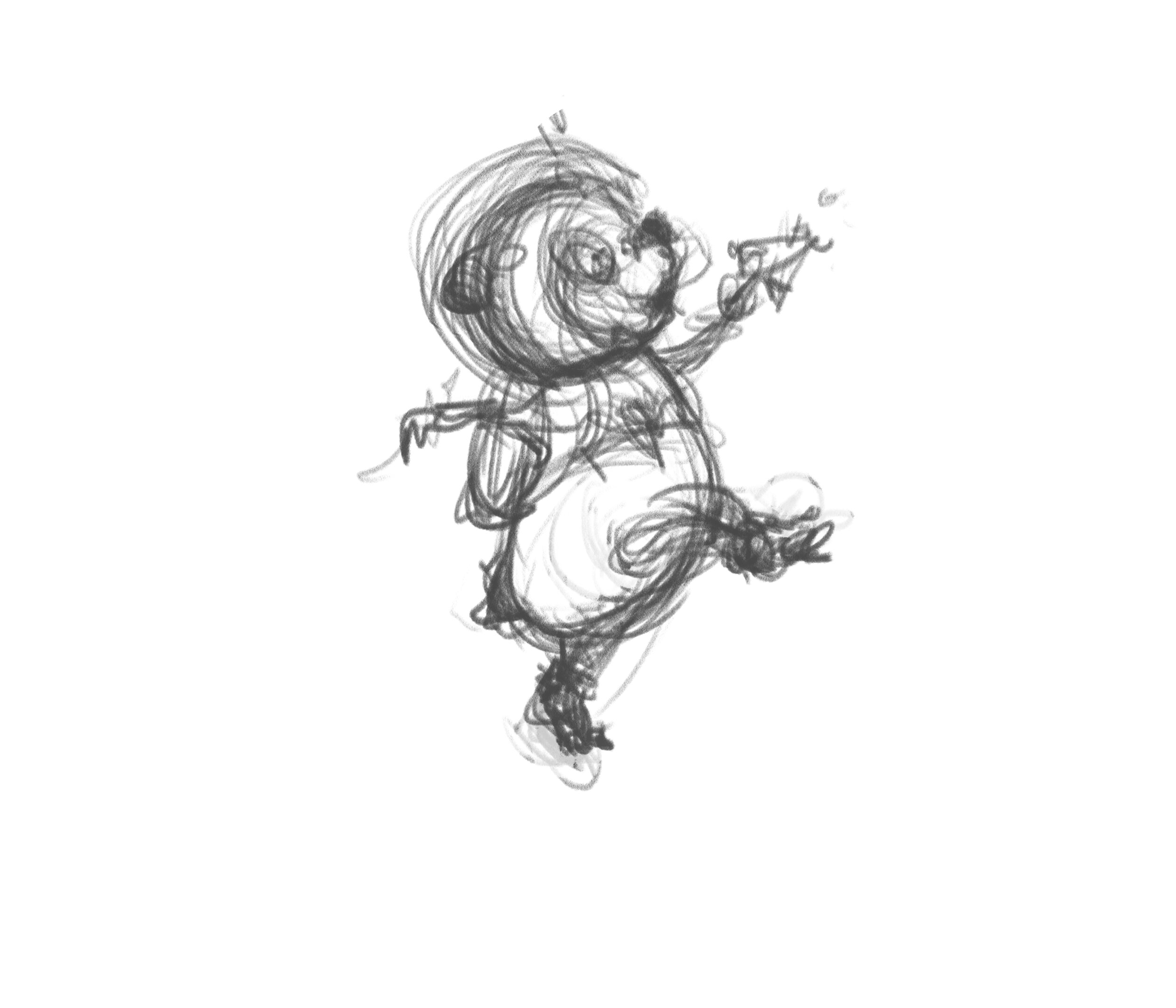
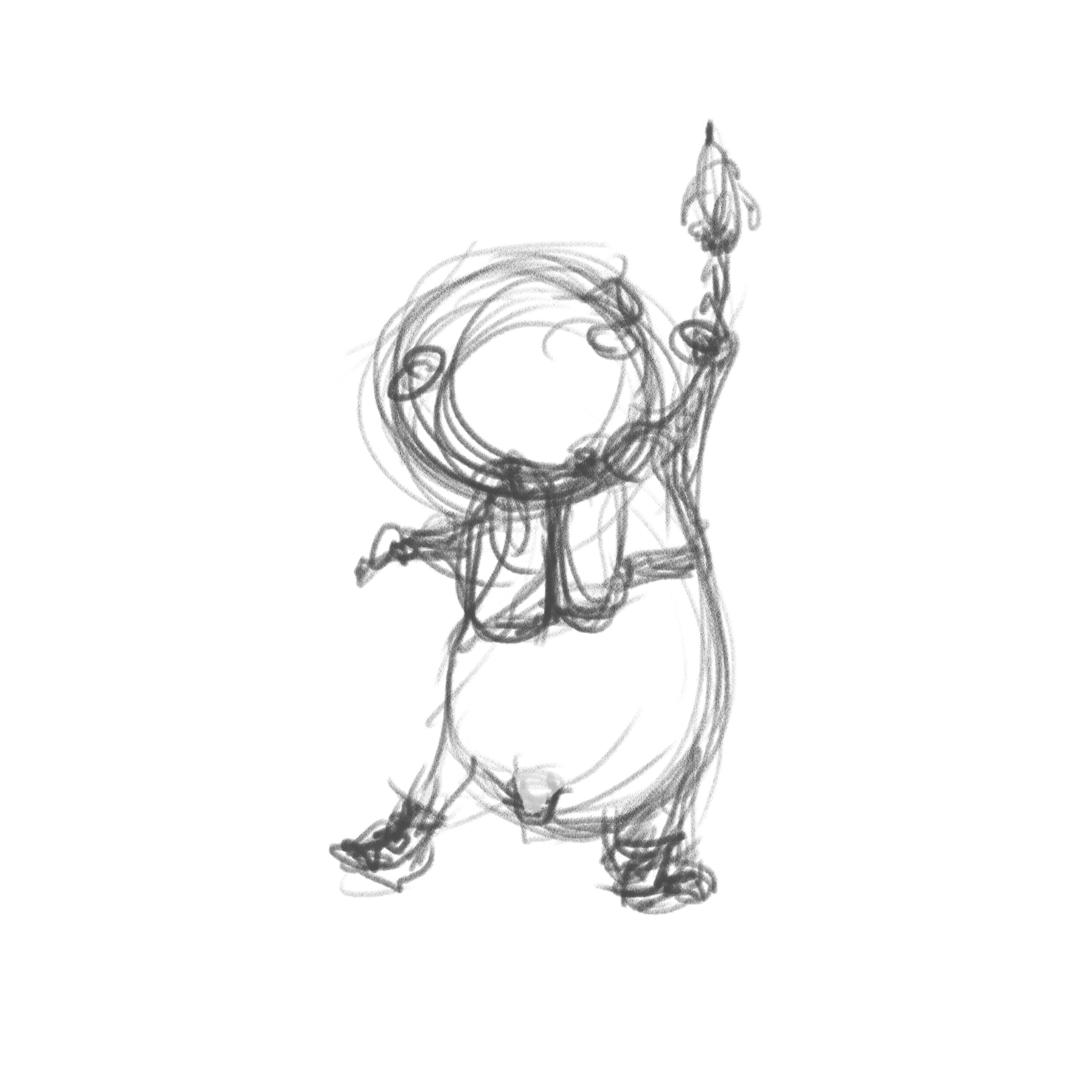
Original Sketch and Scribble illustration by Marjorie

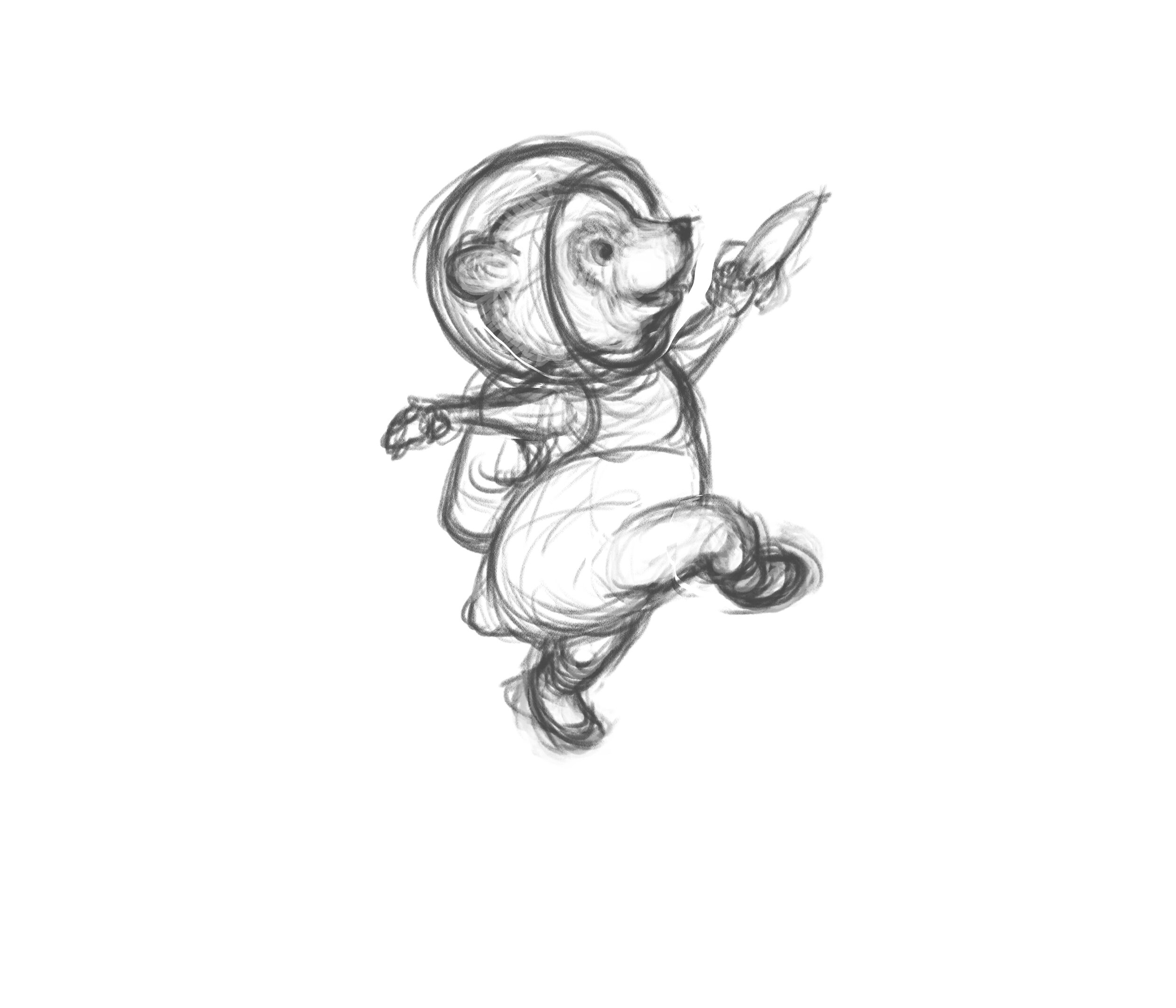
Original Sketch and Scribble illustration by Marjorie

As we wrote and drew, I snuck a look at illustrator Marjorie Crosby-Fairall’s sketchbook and saw her picture of a bear floating in space. My writer’s brain immediately began asking:

Why is he there?

What’s he thinking?

Why does he look so happy?

I asked Marjorie if I could write Bear’s story and she agreed. I went away and, being the painfully slow writer that I am, I took a few weeks to get Bear ready. Ten minutes after I sent Marjorie the story, she wrote back saying it gave her chills. Turns out, I’d written about her son.

THE BOY

Marjorie's son Cavan as a thunderbird.jpg

When Marjorie’s son Cavan was young, he was quirky and analytical and he was obsessed with space. So much so, that when he was due to start preschool, Marjorie and her husband worried he wouldn’t find any friends, but luckily he met another boy who also loved space and they became best buddies.

As a kids’ author and teacher, I’ve always been intrigued by the kids who are different. The ones who don’t quite fit in. I wanted to write a story where difference is celebrated and let kids know that what makes them different is also what makes them unique!

So what’s the story of Bear in Space?

Bear doesn’t always feel at home on earth. He doesn’t quite get the other bears and they often don’t understand him. So he disappears into books, especially about space. When he builds a rocket, and flies into space, no one laughs at him or calls him names, but soon he’s lonely, until something extraordinary happens.

THE PITCH

I pitched the story to Walker Books Publisher, Linsay Knight, who published my first novel, Max Remy Superspy in 2002. She loved the story but asked, ‘Where’s the third act?’

She was right! It ended but there was no ending.

Big difference!

Bear Thumbnails.jpg

So Marjorie and I created thumbnails to work out the rest of the story. These were crucial in developing not only the artwork but the story. Poring over them, we made sure the story flowed and had a strong structure…including that ending. We spoke about pacing and page turns, character and emotional beats, colour palettes and white space. Where the story needed to be bright and full, and where it needed to breathe.

As many of you know, it’s an unspoken rule that publishers DO NOT like authors and illustrators to work or pitch together, but the story so intrinsically belonged to both of us, we couldn’t imagine not working on it as a team.  

So we ignored the rule.

CHARACTER ILLUSTRATIONS

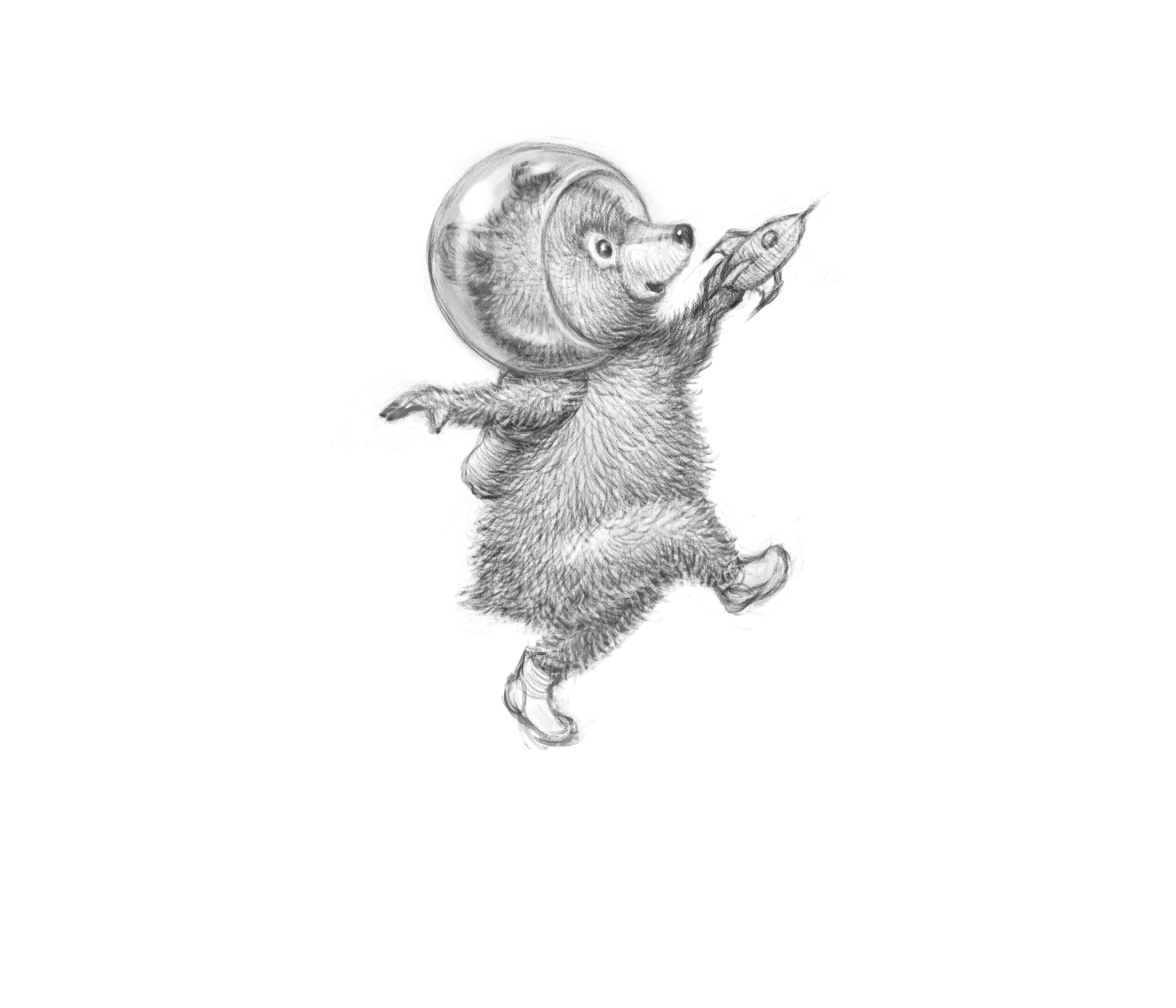
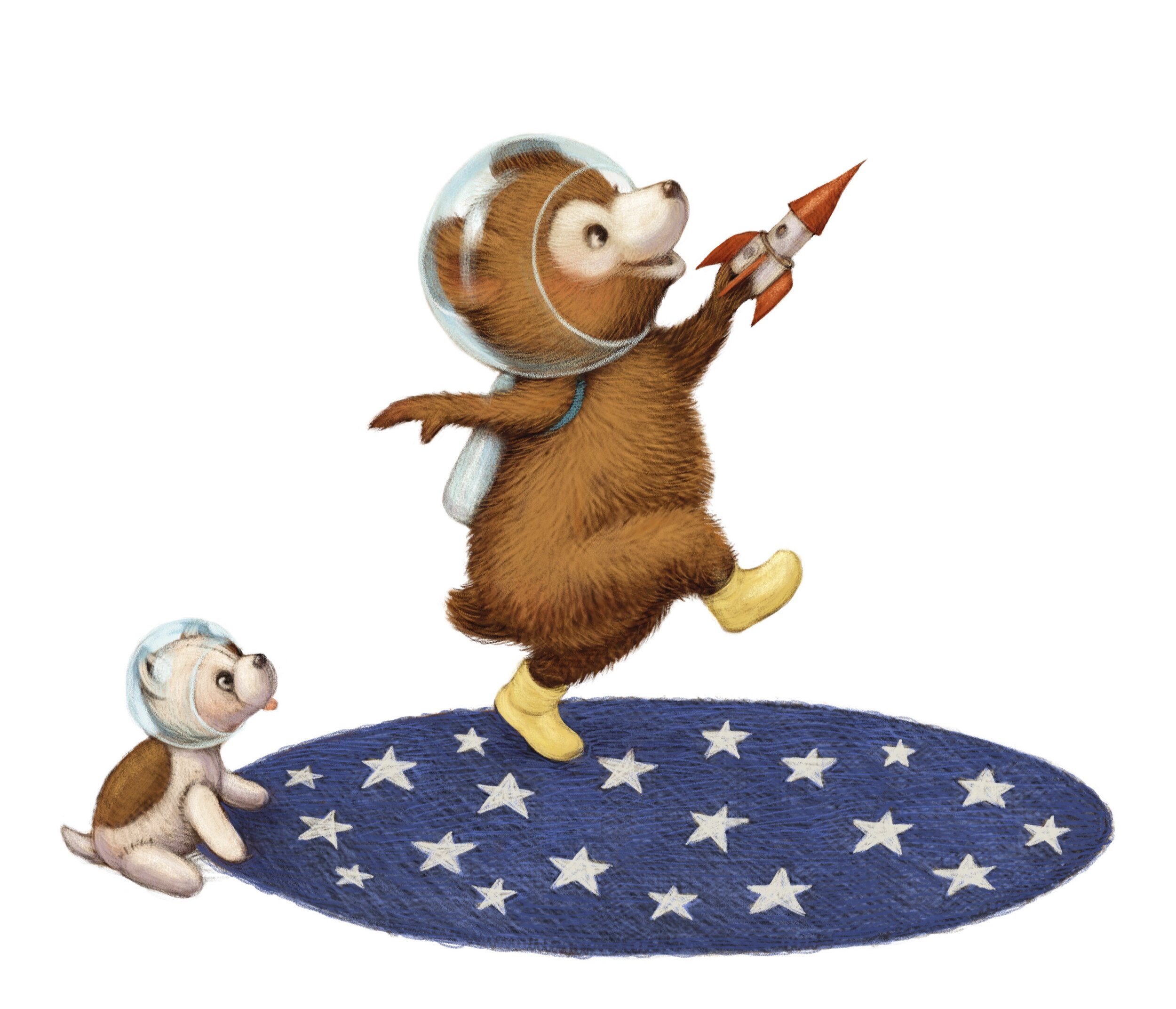
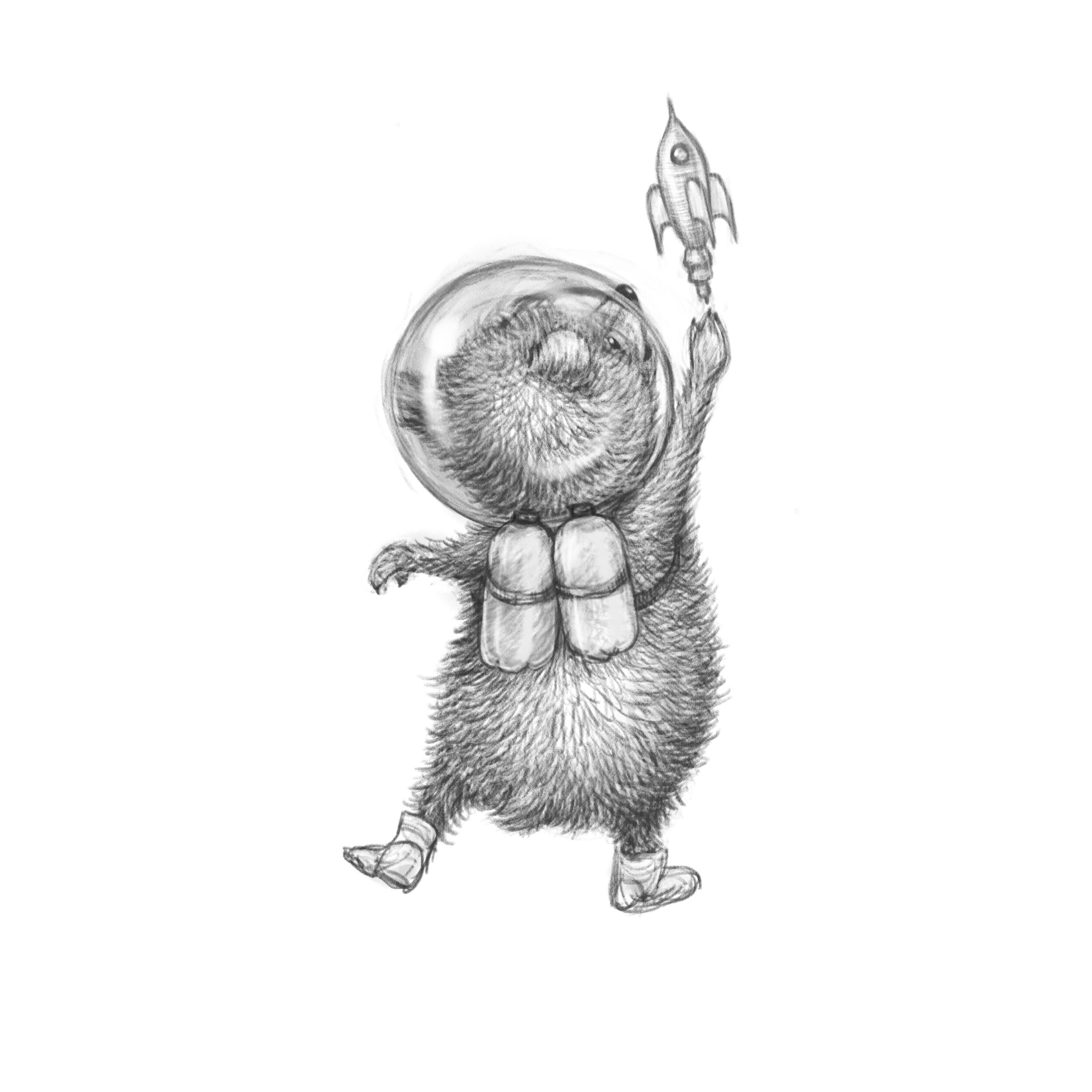
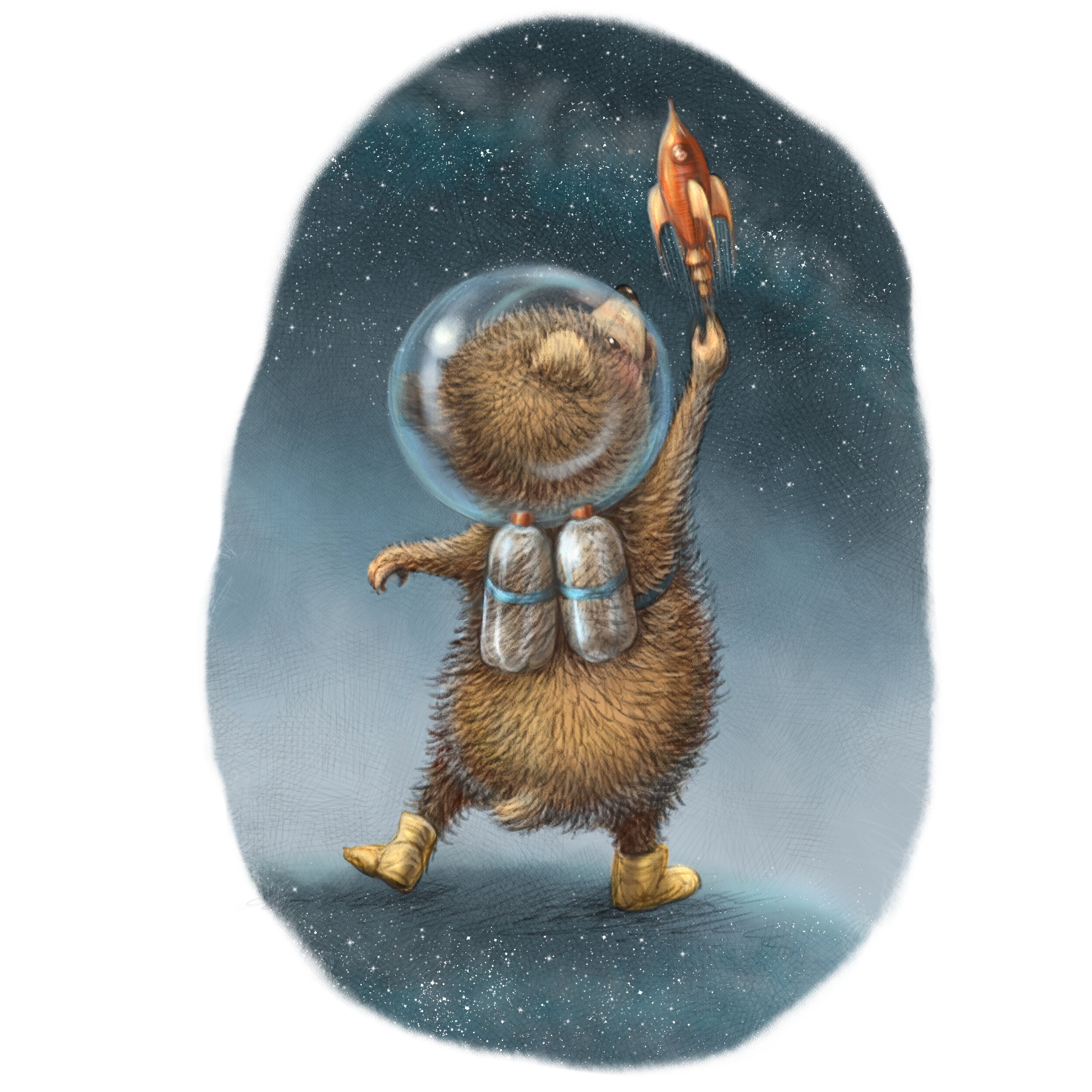
Linsay and art director, Sarah Davis, wanted Marjorie to draw the main character in various poses, to see how he’d look but also gain a sense of his personality. The original Bear sketch from the zoo wasn’t intended for a picture book, so Marjorie needed to rework the character so he was more childlike. These images show the development from the initial sketch to colour studies.

 THE BOOK IS CONTRACTED!

Linsay and Sarah loved Marjorie’s drawings and we signed the contract. Phew!

FROM ROUGHS TO FINAL ART

Marjorie took her thumbnails to roughs and when they were approved, to final colour art.
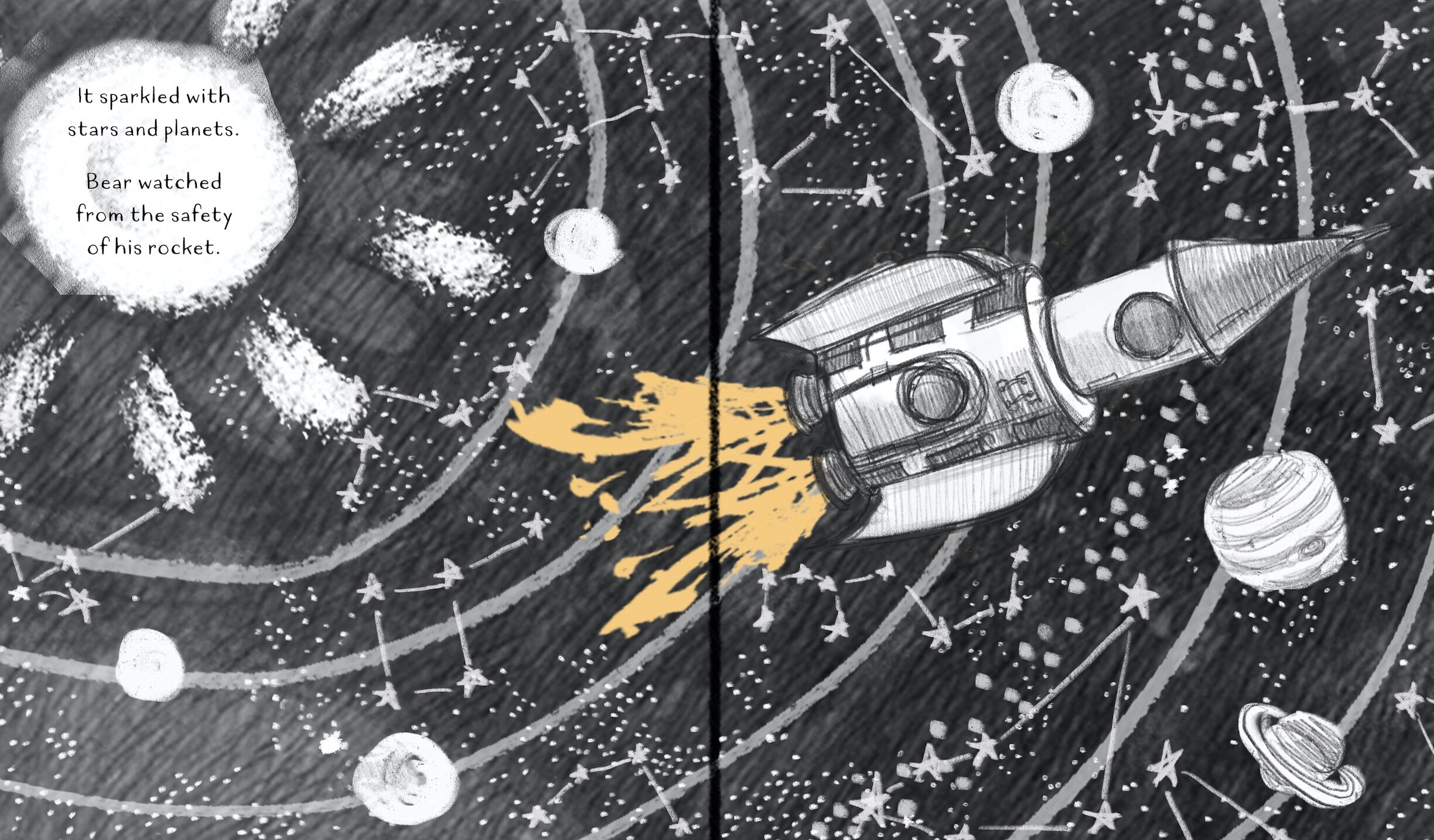
 FINALLY

The whole process was collaborative and at each stage, we hashed out ideas, we challenged each other’s decisions and we all fell in love with Bear.

Sometimes it’s good to break the rules, and back yourself. But also, put in the hard work.

For Bear, sometimes it only takes one person to make us feel not so alone. One person who understands us. Bear in Space is about being different and having friends who love us just the way we are.

Watch the trailer for Bear

Teacher notes

Build Your Own Rocket


BIOS

Deborah Abela www.deborahabela.com

Deborah trained as a teacher and was the writer/producer of a national children’s TV show before writing twenty-seven internationally published and awarded kids’ books. There’s her cranky climate change trilogy, Grimsdon, New City and Final Storm, and The Stupendously Spectacular Spelling bee and The Most Marvellous Spelling Bee Mystery.


Marjorie Crosby-Fairall www.crosby-fairall.com

Marjorie has illustrated over twenty children’s books and has been published internationally. Her awards include the CBCA Eve Pownall Award. Her books include The Boy in the Big Blue Glasses with Susanne Gervay, One Christmas Eve with Corinne Fenton, Say Cheese with Frances Watts and Dinosaur Dads with Lesley Gibbes. Bear in Space is Deb and Marjorie’s first collaboration. 


Chapter Two: Climax! The Craft of Illustration

Skpe Session B: The Craft of Illustration with Caldecott award winning US illustrator Paul O. Zelinsky MC: Sarah Davis and Marjorie Crosby-Fairall

Paul Skyping from the US

Paul Skyping from the US

I’m an Illustrator and I was really looking forward to this amazing opportunity to listen to Paul O. Zelinsky. There is a lot of advice out there on illustration and how to develop as an Illustrator. Paul was really keen to not come across like his advice was the only way forward for an aspiring illustrator and I really appreciated that. Though, I agree with everything he said. Especially when I’ve had a recent portfolio critique from some amazing Art Directors and a subsequent master class with Sarah Davis - all of them sharing the key themes of ‘feeling’, ’heart of the story’ and ‘using different mediums to extend and stretch yourself as a visual storyteller’.

More info about Paul can be found on his website http://www.paulozelinsky.com/, Facebook (https://www.facebook.com/paulozelinsky.illustration/) and twitter (https://twitter.com/paulozelinsky)

Below is a recap of the discussion. Sarah Davies and Marjorie Crosby-Fairall collated questions fellow SCBWI members had and boiled them down to the following :

Q - When you receive a story, when you are illustrating someone else’s text, what is the process you go through, how do begin getting to grips with the text, breaking it down, working out which direction you want the illustrations to go in?

  • My first reaction….I don’t know what I’m going to do. That’s one of the consequences of not having a really established style or way of working that I do the same time each time.
  • I read and read and read the text. Even if I wrote it, it doesn't really make a difference to me whether it was it was my text or someone else’s text - I kind of absorb it as much as I can. I am aiming to do the right thing for the text.
  • It’s free association, [ between feeling and what visual imagery to use ]

Often times, it’s what I don’t want the picture to look like. That’s enough of a clue to get me going a little bit.

I was not trained in illustration at all. I got a Masters degree in Painting. I think of Fine Art, the whole history of Art all kinds and all places.

  • What is the feeling that this text gives me?
  • What sort of pictures do those feelings call up?
  • I try to be in-tune with every level of feeling of the text.

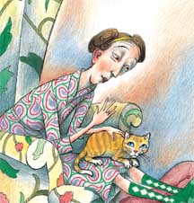
Paul then showed us “The Story of Mrs. Lovewright and Purrless her Cat” by Lore Segal

This story has a feeling of ‘not cosiness’.

So German Expressionist (with its angles, and sharp lines, poking and not sitting flat) - that’s what I tried to do, pictures that would not sit flat, have angles and sharp points.

Q - Mediums - Do you have a favourite medium? How much experimentation does it take to match to the feel that you want to create? How do you go about deciding which medium you use?

At the beginning I don’t really have a handle what I want my pictures to be like. The medium is often the first I can settle on because of the feeling, because for me different mediums define different sorts of feelings.

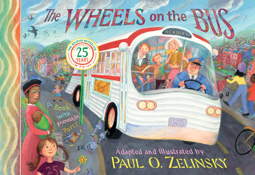
“The Wheels on the Bus” adapted and Illustrated by Paul O. Zelinsky

It’s a jumpy song, bright and happy. The feeling that I wanted visually was not just colourful but also ‘chewy’ like bubblegum. The pictures should be something that you could want to chew on and they’d be sweet when you ate them.  The song is bouncy.

[So I went with] oil paint with a certain amount of thickness. The act of pushing oil paint across the page felt sort of like the feeling of singing the song.

‘Awful Ogre’s Awful Dday’ by Jack Prelutsky

There was a high level (castles, knights) and a low level (a messy, gruesome ogre). For a long time I wanted to make pictures that were like throwing mud - thick and droopy. I looked at Abstract

Expressionist paintings - visually interesting compelling gooey textures. I tried it for two weeks and despaired.  I then tried a combination of elegant line (inspired by Albrecht Durer) and  watercolour on top of it that would have its way of being messy.  The story had a high level and low level and I was trying to come up with ways to express that contradiction, which made the text so funny.

At the beginning I’m always worried that I won’t come up with anything.  Most of the time I’ve pulled myself through.

Paul's Zelinskograph

Paul's Zelinskograph

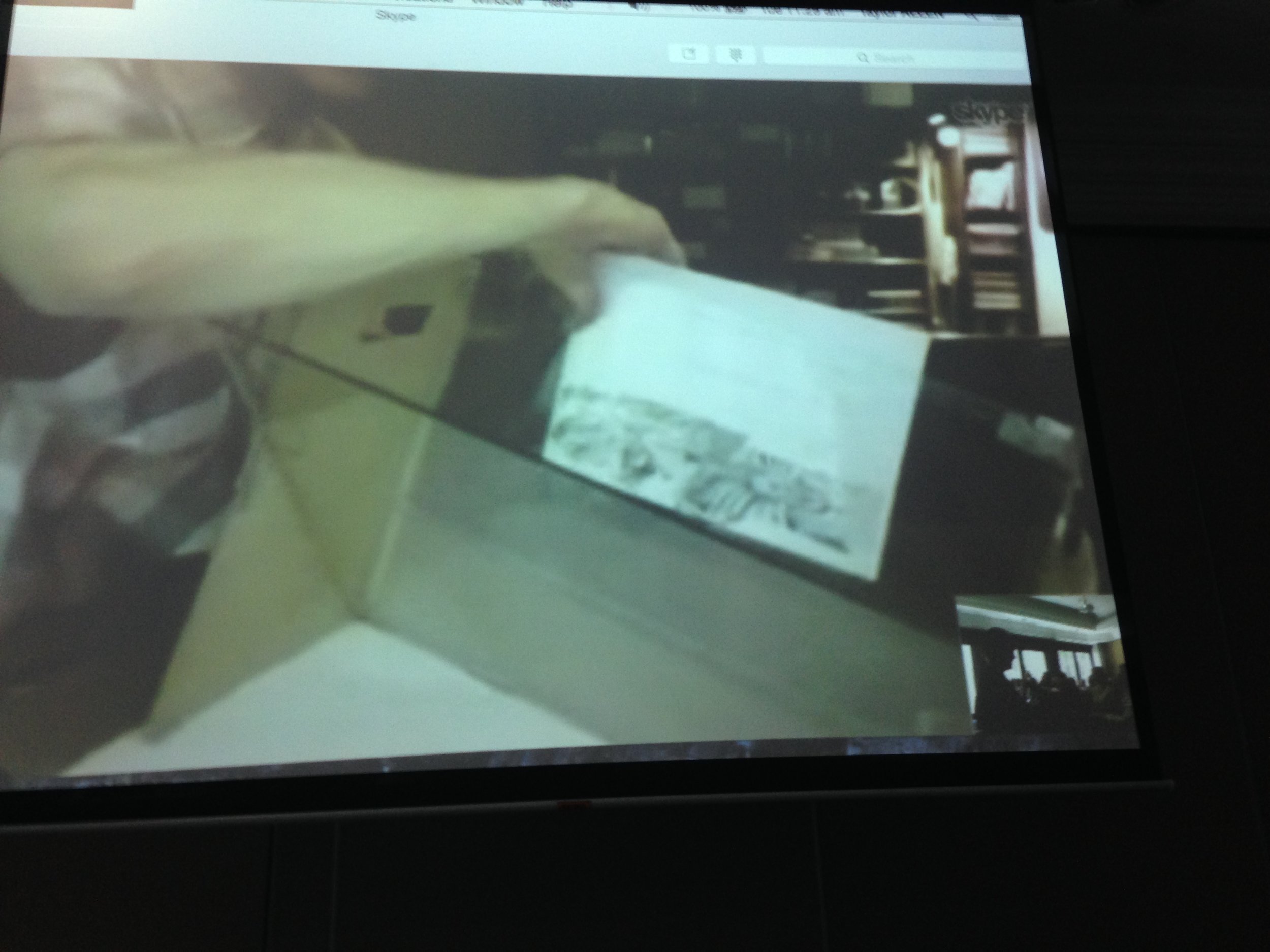
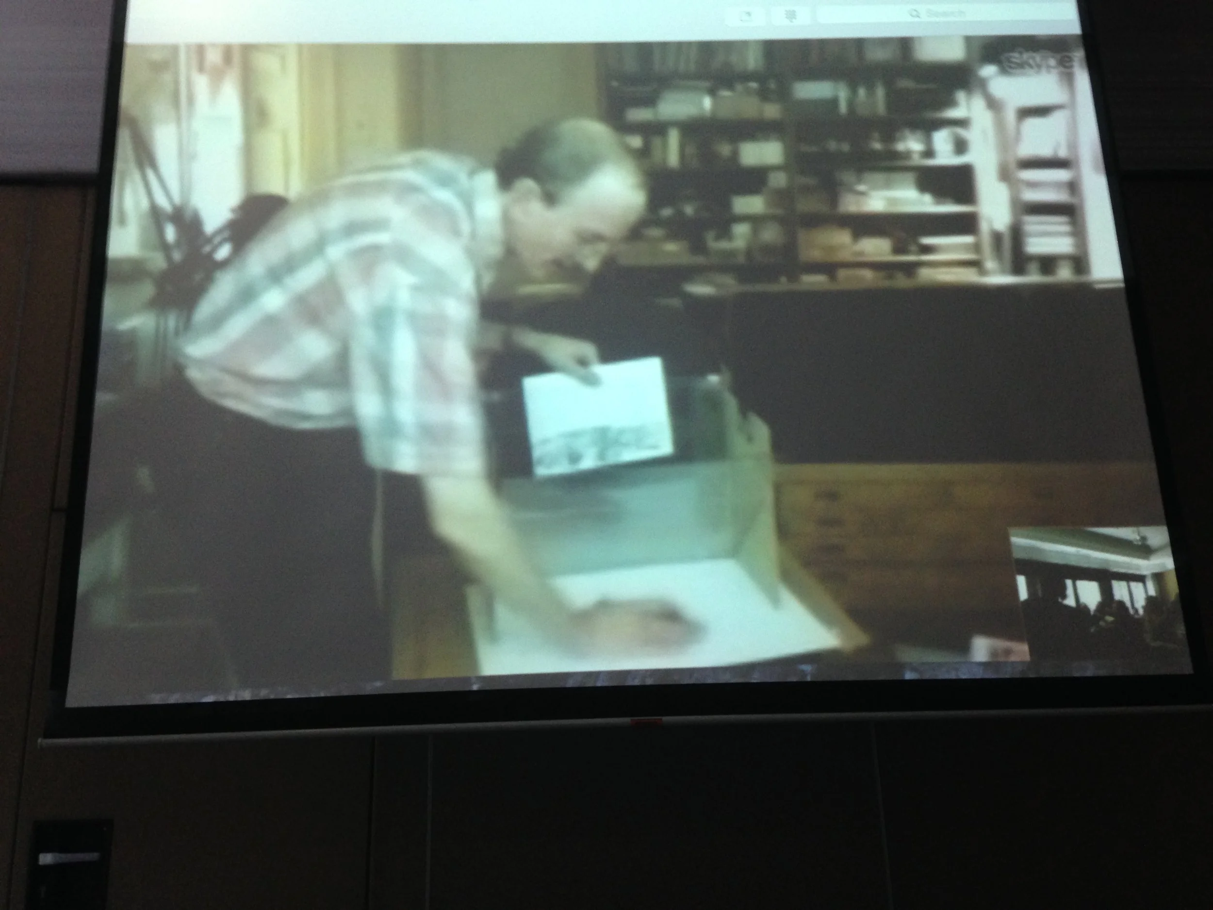
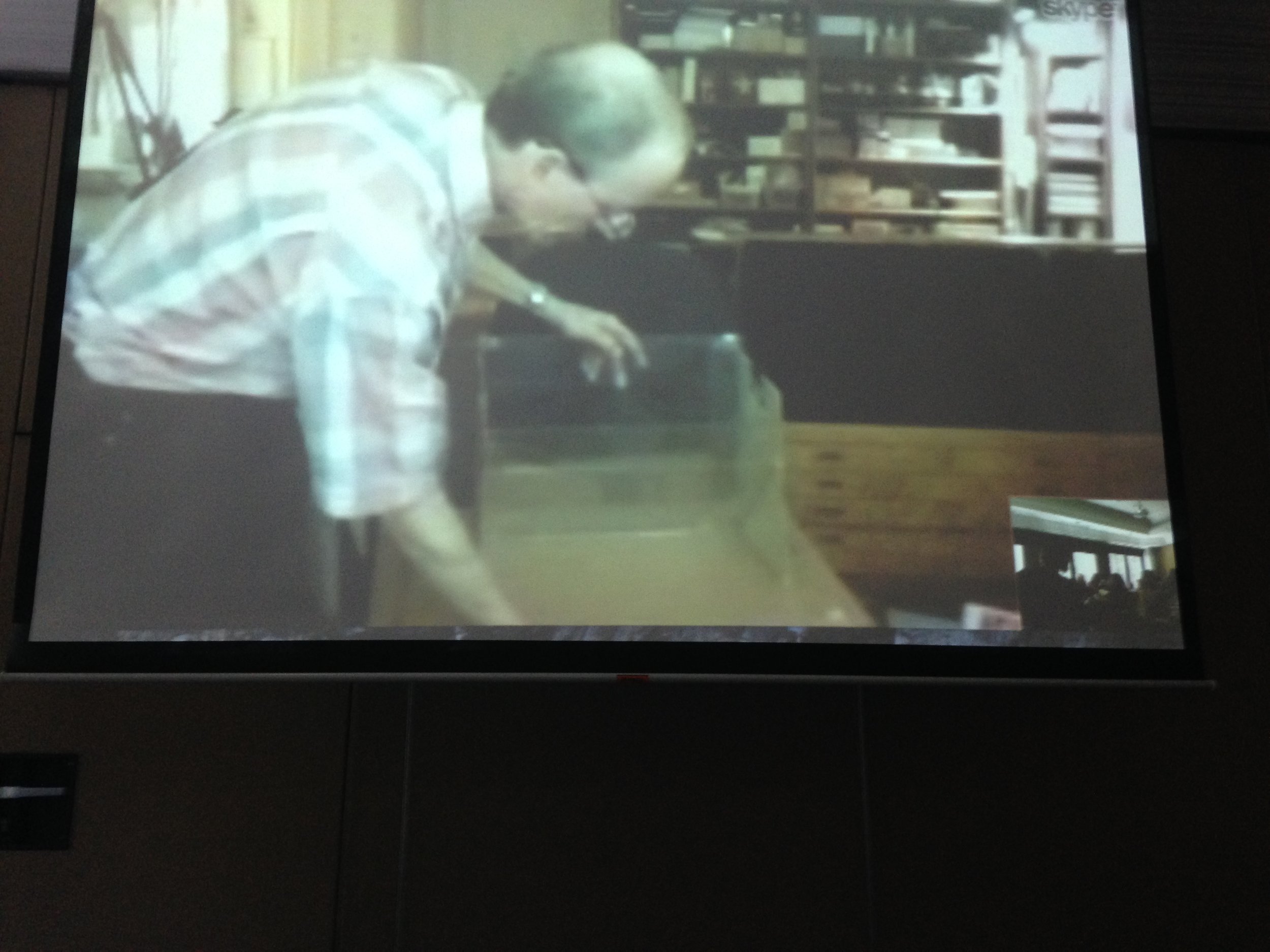
Paul then showed us his ‘Zelinskograph’ - a marvellous device he made so he could see a projection of his sketch on top of the surface he wanted to paint on. He called it a tracing box but his friends coined it the ‘Zelinskograph’.  Here’s great blog post with a clear photo of the ‘Zelinskograph’

https://penandoink.com/2014/04/21/a-studio-visit-with-paul-o-zelinsky/

Q - It has been heard that you’ve said. “Photoshop doesn’t have a lovely smell and you don’t engage in a physical dance as you would with physical material, as you would with pen and paper, but it takes forgiveness to whole new level”.  What’s the role that Photoshop plays for you?

I don’t expect to plan or go more and more digital. The last book I did was completely digital.

Paul then shows us some spreads from his hilarious book ‘Doodler Doodling’ by Rita Golden Gelman .  "I didn’t take a course in Photoshop, but I would try things. I did a lot of drawings on paper and then scanned them in and put them into Photoshop and every now and then a friend would say ‘oh do you know the right way to do that was this...’.  ‘Oh was it?’  and it would have saved me a lot of time if I had used Photoshop in a different way. So it turned out I did a lot of things wrong, wasted a lot of time, but learned a lot, too..

Spread from Doodler Doodling

Spread from Doodler Doodling

Photoshop allows me to do things that I could not have drawn.

I like the challenge - here’s the problem, what can I do to solve the problem… and if I come up with the solution then that’s just great and Photoshop is good for finding ways to coming up with solutions to certain problems.

Q - We have a lot of people who are just starting out in their Illustrator career - what’s pearls of wisdom could you provide?

Paul notes that this is just from his experience and not the only way.

  • I would encourage people to not limit your artistic vision to illustration, but think about the whole world of other kinds of art and everything. There are a lot of trends that happen in illustration… and if you look only at children's books then it’s limiting…and that’s just me because I didn’t study illustration.
  • I go to figure drawing and draw from the figure once a week if I can. Drawing from life is a great thing and is good for training.
  • In terms of ways that you can make images, I just look at different things.
  • And copy Art. It’s amazing what you can learn if you just start copying it.
  • Writers as an exercise will retype someone else’s story and the act of putting down someone’s words will give you insights.
  • Drawing from life is similar to copying from art. It teaches you to see more things then you would otherwise see.

Career advice? It’s different now  from when I started. Illustrators in the US, can send their work to Art Directors and it will be seen.   (Giuseppe: from what I’ve heard, it’s the same here in Australia. Publishers are always keen to receive samples of an Illustrator’s work.)

Q - how much freedom do you get to experiment? How much notice do you have to give your Publishers?

I show them at an early stage and I like to get feedback.

I look it as a terrific collaboration -  they need an artist, they need art…and they want someone with a vision, someone who can have interesting ideas. Everybody thinks that they are someone who wants to bring out the artistic potential in everybody. If you deal with people on that level - it is a collaboration. You try together to make it as interesting and fun as possible.

I’ll show them an idea very early. If I find they don’t like it I might agree. If I disagree then we’ll discuss it further.  Every publisher is different.

Questions from the audience :

Q - Do you still do painting for yourself?

No. When I first started out, I was making this distinction in my head, that this is for my art and this is for my illustration. I was using oil paint for my art and anything else for my illustration. I guess I came to the point I wanted to illustrate a Grimms' fairytale and I really needed/wanted to do it in oils, which blew my strategy out of the water. And then I started looking at the illustration work and I was making better art for the books than I was for myself. So I stopped and I don’t really miss it.

My ambition is channelled into the illustration I do - illustration is painting, it’s also pictures  telling stories and they are also as interesting as art as I can make them but they are also telling a story. I don’t think that it stops them from being art even though some may not think so.

Q - You mentioned a lot of about feeling - it’s the number one thing in your approach. What’s the second thing?

There will be feeling behind everything. The first thing that would help me make it would be the proportions of the book, is it going to vertical or horizontal and how much - and I guess that’s purely on feeling. I ask myself that and I can answer  because I know from having read the story.

The feelings are the sound basis for everything.

Every kind of real world physical question (what materials, what medium, etc) comes from the feeling but then you have what will the character look like… what should it not look like, what are the sensations of that character? are they soft or hard, big or little, darkness or lightness?

Hansel and Gretel…I had the feeling that it was about little children lost in a big wood and I could get the emotion to flood the image. That  was the basis of everything that I did …like the kinds of trees that I put in, the kinds of colours.

“The Story of Mrs. Lovewright and Purrless her Cat” by Lore Segal - I learnt from myself about using colour doing this book.

  • You don’t have to have a huge number of colours.
  • You can think of having a colour chord in relation to the book and that colours can change as the story changes and the emotions in the story change.
  • That was really a revelation and that too was all about the feeling of the story

[*Editorial addendum from Paul himself! "I thought afterwards that I should have answered the "what's the second thing" question differently: although I did speak in my response about book format andlook of character and use of color --so I wasn't totally deflecting the question back to my one answer of "feeling,"-- I wish I had mentioned the act of dividing the text up into pages. So much follows from the choices in that act-- the structure of a picture book; the rhythms and the pacing. Page turns are the one real dynamic artistic effect unique to books, and they are set in place by that one act, at the beginning, of taking the more or less continuous stream of text in a manuscript and turning into a 32-page (or whatever) codex. I didn't mention this and I wish I had. So I took the opportunity to tell you, even though I think it would be editorially wrong to include it here!"]

Susanne Gervay comes in to thank Paul, there’s a huge applause and that concludes the session.

Thanks Paul for your time - you wow’d us, you made us laugh, you left us inspired and empowered.

A big thanks again from the delegates there,

Cheers!

Giuseppe Poli Roving Reporter

#SCBWISyd


SCBWI Success Story - Lois Bury

Big shoes to fill after Pamela Rushby’s piece in last month’s newsletter, I was there for her pitch and loved it, how exciting that it has now accepted now for publication!

My story goes back to 2010 when I was nursing in the area of Diabetes Education, a sad time as my brother was then diagnosed with mesothelioma (asbestos related lung cancer) and I said to myself. …...’what would I REALLY like to be doing in life?’  Well, I wanted to be an artist, not knowing what form that would take or which direction to go in, I stopped work and started drawing birds!  As we had visited Bruny Island many times, it seemed possible to sell work on Bruny at a gallery in Dennes Point.  A passing comment about illustrating caught my attention (it is amazing how one listens out for conversations and opportunities) and it was ‘game on’ from then on.  I attended the 2012 Sydney Conference with no idea what I was doing, taking a portfolio of horses, goats, ducks, dogs, all very arty and well-drawn but not what is necessarily needed in publishing!  It was a steep learning curve and even though I didn’t get many points for character development, narrative and visual quality, I was hooked.

Attending SCBWI meetings in Melbourne, Adelaide, Maldon and Sydney, putting my name down for assessments and hogging the only chair in the children’s literature section of Fullers Bookshop in Hobart (I am classed as a senior) I fell completely in love with this world.

I have finished illustrating two books now, and about 8 months after the 2014 Sydney meeting I was phoned by Brian Cook, a literary agent and asked if I would like to join his stable of illustrators.  Well, I am amongst some esteemed company and although I have had discussions with NLA and Penguin, I am waiting for my third book to jump out at me.  Getting your work out there and going to as much as possible is still vital, the hard work doesn’t and hasn’t stopped. So, I am now working on a new portfolio for a meeting in Melbourne in May with KidLitVic…….no horses, goats, ducks or dogs...well not as many.

Thank you to SCBWI for making my world so much fun!  I love the support, friendships gained and the professionalism of all involved.

http://www.loisburyart.com.au