Perfect your Portfolio with Donna Rawlins

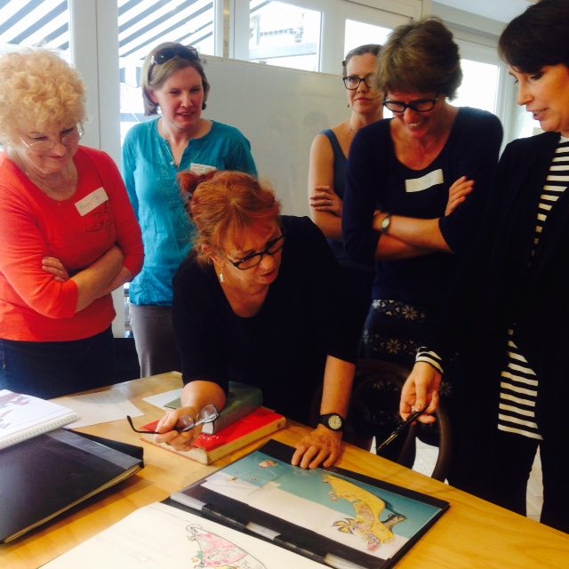
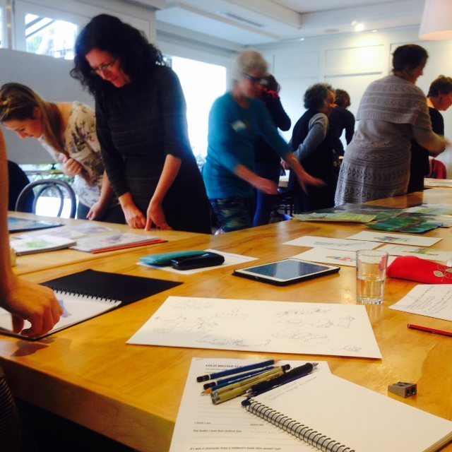
If you were one of the very fortunate SCBWI members to be at this event, you’ll have spent an illuminating afternoon with one of the kids’ book world’s wisest and loveliest, art director and illustrator, Donna Rawlins. Donna had so much wonderful advice that it was hard to get it all down, but I’m going to try and condense it here.
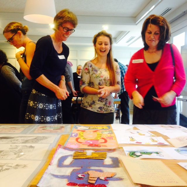
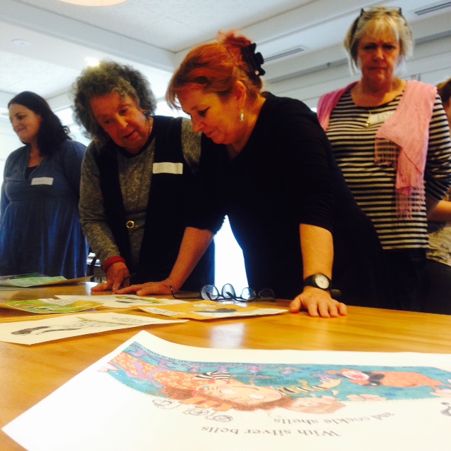
Firstly, Donna wanted all illustrators to know that they are storytellers and that every illustration has to earn its place on the page. Art director and illustrator, Wayne Harris tells fellow artists, ‘You are providing the adjectives the writer has had to leave out.’

She added that you need to read and read. To be a good picture book illustrator, you need to be bibliophiles and your portfolio needs to reflect that.

Work to the Child Within You

Donna began by asking us our real ages ….many of us were about 8, some were teenagers. Others were 2 years old. Donna believes this is the age where something happened to us to make us aware of ourselves and made us aware that we were separate to other people. It is important because the greatest critic of your work is that child in you. They are your first real editor and if you take on a story that is not right for your age, it will feel like a chore. If you work to your age group, it will feel like a guilty pleasure.

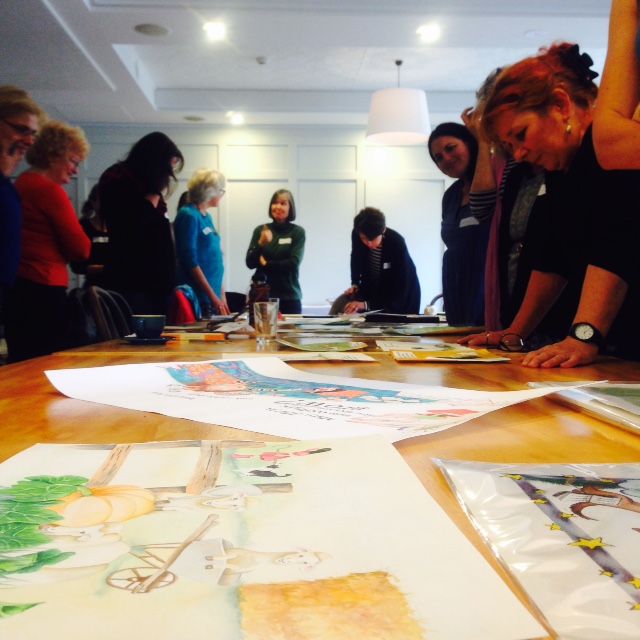
The class was asked to bring along a drawing of their favourite nursery rhyme, (which were amazing!) to allow them to go back into their childhood and experience the picture as a kid and have that kid critique it.

Process of Choosing an Illustrator at Walker Books

Several illustrators are put forward to the team for a text. The aim is to choose the perfect combination of art and text for the best version of that book. It is always done with the author’s approval.

Once an illustrator has been chosen and the contract signed, Walker will ask for character sketches, roughs or storyboard.  

Donna pointed out that if a publisher approaches you, they love your work, trust you and firmly believe that you are the right person to do the job but to be open to direction. Art directors will always give notes (with love in their hearts), to entice your best work from you. Donna’s job is to know you and your work better than you from her experience as both an illustrator and art director.

Some Cold Hard Facts about Folio Submissions

All publishers receive many, many folio submissions and keep most of them on file, however, perhaps fewer than 10% will be considered to be of a standard appropriate for their list. Most successful submissions clearly demonstrate the artist’s connection with and love for books.

A Few things to Consider including in your Folio

  • At least 14 pictures of your best work.
  • Add a nursery rhyme (with text)
  • Show a sense of narrative – include a series of 2-3 sequential drawings. Show pacing and consistency of character across different illustrations.
  • Show some degree of emotional depth in characters eg scared, shocked, angry.
  • Use an existing, published story and complete a storyboard for it.
  • Include a rough followed by the finished drawing so they can see how you approach your work.
  • Include B/W drawings – this may double you chance of getting work…there’s a lot of call for B/W junior chapter books.
  • Media/Techniques – Show as much of a range of your versatility as possible. Choose a drawing and then do it in a different range of styles – charcoal, pencil, paint, acrylic, pastel, collage etc.
  • Experiment with a book cover for a novel you love.

What’s the Best way to Submit?

  • As a PDF that you email or collection of JPEGS on a disk with a selection of printouts of your best.
  • Include a cover letter and add anything of interest about you that may show your range as an artist… eg you’ve travelled extensively, you’re a marine biologist or you used to work as an anatomical illustrator. Let them know about your brain.
  • Never send originals.

And Just a Reminder…

  • Publishing professionals change, so resubmit if staff has changed.
  • Keep track of who you send your work to, what you’ve included and when. Find out who publishes what and make sure you address it to the right person.

Thank you so much to Donna for her advice, her knowledge and her warmth and generosity.  


Interviews with Industry Leaders: Donna Rawlins

Donna Rawlins
Designer/Illustrator, Walker Books Australia

Donna Rawlins is an illustrator, book designer and teacher and in 2003 was the recipient of the prestigious Lady Cutler Award, presented by the Children’s Book Council of New South Wales, for her outstanding contribution to the children’s book industry.


How did you get your first big break in the publishing industry?

I came to publishing from two directions. In the late 1970s the writer Max Dann and I entered the Margareta Webber Competition for an unpublished picture book and were chosen for the exhibition of shortlisted projects. It was never published (thank goodness!) but it did introduce both of us to the children's book publishing industry in Melbourne. The next step was to really educate myself about children's literature. I was still young and had a lot to learn. I read and read, developed a passion for some favourite writers and illustrators, and drew and drew until I had a folio I felt confident to 'shop around'. 

Working with educational publishers was the best apprenticeship any illustrator could have to be 'fast tracked' in the process of children's book publishing – particularly learning how to use the critiquing process as a challenge to improve my work. I didn't rush that part of my career. There's a lot to learn.

I was also very involved in community art and publishing projects, as a designer, illustrator and printmaker. Later, I hooked up with the ground breaking oral historian, Morag Loh with whom I collaborated on several books, and then went on to create my first two trade picture books with her.

I can't stress enough, the value of getting involved in community projects and volunteering. (I'm not talking about getting involved with self-publishing here though.)

Walk us through a project you enjoyed.

I've worked freelance and in-house for over 35 years now and have worked on so many projects that I lost count decades ago. 

As an illustrator, obviously, the intensive collaboration with Nadia Wheatley on My Place was truly exhilarating. Working with Margaret Wild on any project is always fantastic. We work really harmoniously and because we enjoy each other's company, making a book together is always a great excuse to spend time together. (We live a long way apart after having spent years as neighbours.)

And, obviously, any project with Simon French (my conveniently handy writer husband!) is lovely. 

For me, the project is about both the story itself, and all the things one learns in a creative pairing by endeavouring to get inside the thoughts of your collaborator. While I do write, and am writing more these days, my own projects tend to get put to the back because I genuinely love the companionship of working with a peer. 

What do you most enjoy about the collaborative process with artists?

 As editor / designer / art director, I've enjoyed countless enjoyable creative relationships. As a commissioning editor I had the joy of working with some fabulous writers and 'match making' them with illustrators whose work and philosophies would really harmonise with their own. Some went on to become very strong, regular collaborative teams. Margaret Wild and Wayne Harris, and Libby Gleeson and Armin Greder are two favourite 'matches' from that period.

And, it's always exciting to find a new writer or illustrator with lots of potential — to help them find their strengths, and to share the benefit of my experience with. 

Illustrating is not just about making 'pretty pictures' and the process of making children's books is complex. In the industry, I've seen and heard of a lot of projects that have fallen over, and I've also met so many emerging illustrators who've been burnt by getting involved in 'amateur' projects. If I can help a new artist learn to navigate their way through the industry while guiding them through the creative process, and if I can inculcate a deeper understanding and love of children's literature while I'm at it, then I'm very happy indeed. Then I've got another friend to share my favourite books with!

You have been instrumental in launching the career of many new illustrators, how do you spot the "it" factor?

First up, because I usually see the person's work before I get a chance to meet the person, it's the strength of their drawing. Drawing. Drawing. Drawing. 

So many of the folios we see are really disappointing because despite interesting techniques, or pretty palettes, the artists' drawing skills are really weak — and of course that shows even more in black and white. Being able to draw human or animal characters that have charm and warmth is imperative. And that certainly doesn't mean saccharine sweet either! 

But the reader must identify with and care what happens to the characters so the artist must be able to create protagonists who live and breathe. And that can be done with a stick figure or an oil painting, or indeed a stick in sand, so long as the artist has the same degree of command over their craft that we expect from writers. So, it's drawing skills first and then, of course, it's evidence that the artist has a grasp of narrative. Publishers are after illustrators — for texts — not 'picture' makers — for walls — two very different skills. If I can see a storyteller in that folio, I'm hooked!

As an illustrator yourself, how does that influence / affect the way you operate as an art director and designer?

Well, I think I've made enough 'mistakes' to be able to write a multi-volume text on the subject! Having gone down an awful lot of blind alleys myself, at least I can spot when someone else is about to trip on the same wire I have before them. That's not to say I imagine every illustrator travels on the same trajectory, but there are many hurdles we encounter that are universal, both intellectual and technical. It's always comforting to have the companionship of a fellow traveller when the going gets scary, and I try to be that person for 'my' illustrators, just as my illustrator friends have always been for me. It's a very collegiate industry. But it's not only about being cautionary or being able to empathise. Some tricky problems just need the help of a craftsperson who's experimented their own way out of potential disaster! But, I certainly don't try to 'draw through' another illustrator, or steer their styles towards my own. It's my job to help them find their own answers, not to do their job for them. 

What three books would you consider must reads?

Oh dear. That's tough. Of course there are countless inspirational books for illustrators; the biographical collections of favourites such as Quentin Blake, Maurice Sendak, Edward Ardizzone, Lizbeth Zwerger, Helen Oxenbury, Ezra Jack Keats, Ernest Shepard —so many spring to mind.

I think it's important to listen to the wisdom of the great book artists, but I also believe that it's critical to come to know the works of the very best writers for children as well, and there are some fantastic commentators on children's literature who'll lead you to the best. John Rowe Townsend and Dorothy Butler are invaluable go-to authors for that extensive knowledge and guidance.  To wrap yourself in ideas about picture books, visual literacy, and how children learn to synthesise meaning from imagery, it's good to read such writers as Perry Nodelmann's Words About Pictures, Jack Zipes's various titles, but I loved The Trials and Tribulations of Little Red Riding Hood, and Bruno Bettelheim's Uses of Enchantment is a must read. The fabulous books about playground lore by Iona and the late Peter Opie are extraordinary for their exposition. 

And, of course, we could never overlook our very recently passed, brilliant champion of children's books, Dr Maurice Saxby for his astonishingly deep wisdom and astute observation of the art of children's books.

So, it's very difficult to narrow it down to three books, but I believe every illustrator benefits by learning to find their own place in the centuries old traditions of storytelling through rhyme. So, perhaps my three would be The Oxford Dictionary of Nursery Rhymes, and The Annotated Mother Goose (by William Baring Gould and Cecil Baring Gould).  And then, The Telling Line, edited by Douglas Martin, one of the U.K.'s most respected book designers and art directors.

What makes a great Children's Book character?

As I mentioned before, a character (either written or drawn) must live and breathe. We need to know the character, as though they were us, or a sibling, a parent or a good friend. And we need to care about what happens to them. So they need to have their own individual personalities. 

If a character hasn't been properly developed with love and thought, and invested with some personality, they'll end up being two dimensional, have no integrity, and will fail. 

Stereotypes fail. Derivative work that is too reminiscent of another artist's characters rarely works either. And please, no more Manga unless you're actually working on a Japanese comic!

How do you do it? Obvious. Just step right on into the story you're illustrating. Be the characters. Dress up in their skin, live what they're living, and then draw from there.  

What should an illustrator include or avoid in their portfolio?

Publishers are looking for a range of skills and traits rather than particular styles. It's always interesting to see what an artist's folio tells about them as a person before you even meet them.

We can see the drawing ability, of course. But beyond that, we can tell if a person is a reader, whether they're a storyteller (the primary skill you need to be an illustrator). We can see if the artist understands books, or whether they're more suited to wallpaper or textile design. A lot of people send in folios of prettiness with no sense of character or story whatsoever.

A lot of designers are, in fact, looking for pretty patterns they may use within the body of a design as, say, a background. But that skill is unlikely to get you a whole book to illustrate, and you'd be better 'selling' those images through an image bank.

We can tell if you enjoy research by your subject matter. We can tell if you're a one-style person, or if you're adventurous. We can tell if you're only wanting to illustrate a children's book to show off your considerable talent, or whether you're indeed, child friendly. 

And we can also tell if you're copying another's work, whether you actually read children's books, whether you spend any time looking at real children… the list goes on. 

So, there's a lot more to a folio than just popping a few fab images on a disk if you want to get the gig!

Which picture books have stood the test of time and why?

That's a really pertinent question. It's the first question anyone new to the field really needs to ask because what you'll discover by finding the answer is the most valuable place you could ever start from. 

As a young illustrator I didn't always 'get' why some titles had such long shelf lives — they often felt very old fashioned, and I wrongly assumed it was because people buying for children lazily or sentimentally bought ONLY the ones they had as children. It's too easy to dismiss 'old' books as dated because of an artwork style that's not what's 'hot' now. We have to remember we're looking at books, not clothes. Of course they have to sell in the here and now, but they also need to be strong enough to last the test of time. So, they need, most of all, to be aimed at their target reader. That may sound glaringly obvious, but a visit to a bookshop will reveal, sadly, a disappointing number of books that would stand only one reading, and then be forgotten. Children are great critics!

So, what has lasted? Well, for one of the strongest picture books for early childhood, The Very Hungry Caterpillar (Eric Carle) has to top the list. It's sold one copy every 90 seconds since it was released in 1969. It's got absolutely everything right — age pitch, deceptively simple story with a perfect story arc and exhilarating denouement; a character the reader engages with and cares for; 'hidden' learning, and scrumptious art and design. No wonder it's such a perennial.  

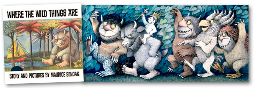
Where the wild things are (Maurice Sendak) is for the slightly older reader. Published in 1963, it has sold in the tens of millions with good reason. Its success is in its perfect pitch to the brooding dark side of an indignant child, the healing power of the imagination, and the ultimately unconditional love of a parent. 

Certainly Margaret Wise Brown in 1947 could never have predicted what a perennial Goodnight Moon would become (proving that its style of art was perfectly okay, thank you very much (!) for the little child being read this clever, clever text. 

And what would Beatrix Potter make of the success of The Tale of Peter Rabbit? — more wonderful proof that one can create perfect books for children without needing to have any of your own.

Of course, the more recent 1994 Guess How Much I Love You (Sam McBratney and Anita Jeram) with its lovely lyrical text, its childlike imagery and its comforting relationship has become a modern classic.

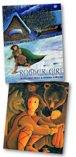
And, many of Margaret Wild's fabulous titles; Old Pig and Fox, both with Ron Brooks, show perfect coupling of art and text and are so profoundly universal in their themes that they will stay in print for decades to come. 

I won't list more. There are so many to find. But it's important to note that without a very strong idea and text, no matter how beautiful the pictures, the life of the book can never be guaranteed.

Which Children's books did you enjoy reading as a child?

Definitely the Babar books by Laurent De Brunhoff. I loved the exotic sense of place, the simple art, and I was passionate about the beauty of the copperplate script, it was like a gauntlet thrown down as a challenge to learn to read!

I loved the very quirky picture books by Munro Leaf, and of course the rebellious Eloise books by Kay Thompson and Hilary Knight. I was quick to move on to fiction, though, preferring to illustrate 'in my head' and was fortunate enough to have a father who liked to read to me.

My parting adage will be from the Finnish architect Eliel Saarinen;  

Always design a thing by considering it in its next larger context – a chair in a room, a room in a house, a house in an environment, an environment in a city plan.

You could translate to the task we have at hand, and add 'the book in the imagination of the child.'